Keeping up with interior painting trends is essential for homeowners looking to refresh their living spaces and add value to their properties. Each year, new colors, techniques, and finishes emerge, reflecting broader shifts in design preferences and lifestyle needs. Staying informed about these trends allows homeowners to create interiors that feel modern, stylish, and harmonious with current tastes.
For homeowners in Orlando, these trends are particularly relevant. The unique climate and vibrant culture of Orlando influence local design preferences, making it crucial to choose colors and styles that complement the environment. Whether you’re looking to enhance the appeal of your home for personal enjoyment or to increase its market value, understanding and incorporating the latest interior painting trends can make a significant difference. In this article, we will explore the top interior painting trends for 2024, providing inspiration and practical advice to help you transform your home.
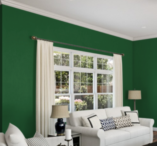
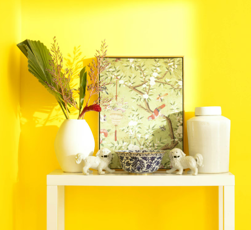
Bold, Vibrant Colors
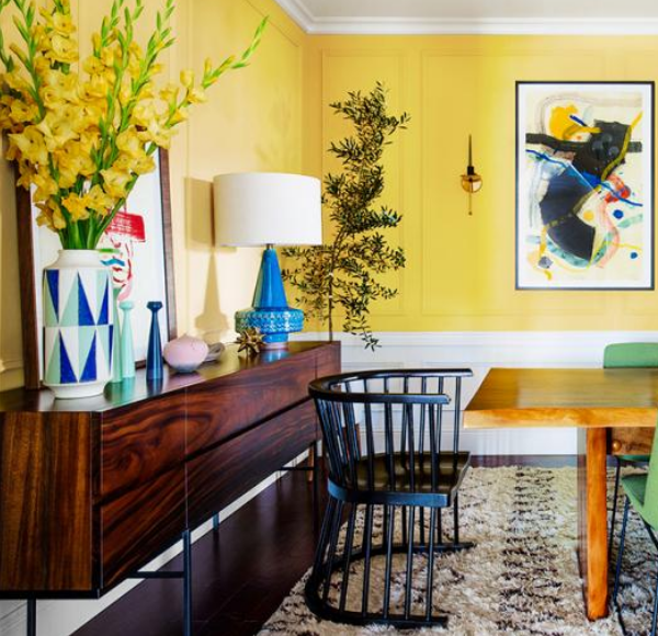
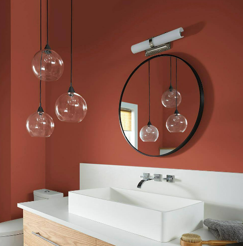
One of the standout trends in interior painting is bold and vibrant colors. These hues bring energy and personality into a space, making a strong visual statement. As homeowners become more adventurous in their design choices, bold colors are being used to create focal points, express individuality, and invigorate interiors.
Examples of Popular Bold Colors for 2024


The year 2024 sees a rise in the popularity of several bold colors. Some of the standout shades include:
- Electric Blue: This intense, bright blue adds a pop of color and pairs well with neutral tones.
- Emerald Green: A rich, deep green that adds a touch of luxury and nature-inspired elegance.
- Fuchsia Pink: A daring pink that adds vibrancy and can be used to create striking accents.
- Sunset Orange: A warm, inviting orange that brings a sense of warmth and creativity to any room.
- Vibrant Yellow: A cheerful, sunny yellow that can instantly uplift the mood of a space.
Tips on How to Incorporate Bold Colors Without Overwhelming a Space
While bold colors can transform a space, using them correctly is key to avoiding an overwhelming effect. Here are some tips on incorporating these vibrant hues:
- Accent Walls: Use bold colors on a single wall to create a focal point without dominating the entire room. This technique allows the color to stand out while maintaining balance.
- Furniture and Decor: Introduce bold colors through furniture, artwork, and decorative accessories. This approach adds pops of color without the commitment of painting entire walls.
- Balance with Neutrals: Pair bold colors with neutral tones like white, gray, or beige to create a harmonious look. Neutrals can help to tone down the intensity of bold colors and provide a calming counterbalance.
- Small Spaces: Utilize bold colors in smaller areas like powder rooms, entryways, or alcoves. These confined spaces can handle intense hues without feeling overwhelmed.
- Layering: Layer bold colors with different textures and patterns. This adds depth and interest to the room, making the bold color feel more integrated and less stark.
- Lighting Considerations: Pay attention to lighting when using bold colors. Natural light can enhance vibrant hues, while softer lighting can create a more subdued effect.
By following these tips, homeowners can confidently embrace the bold color trend for 2024, creating spaces that are lively, stylish, and reflective of their unique personalities.
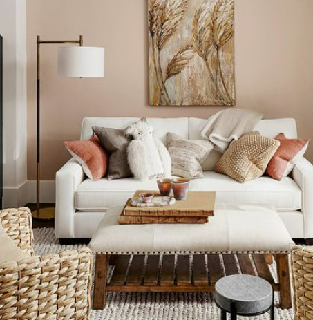
Earthy and Natural Tones
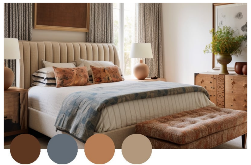
In 2024, the trend towards earthy and natural tones continues to gain momentum as homeowners seek to create serene, grounded, and harmonious living spaces. These colors are inspired by nature and evoke a sense of tranquility and stability. They are perfect for fostering a warm and inviting environment, reflecting a desire for a closer connection to the natural world within our homes.
Popular Shades Like Terracotta, Olive Green, and Sandy Beige

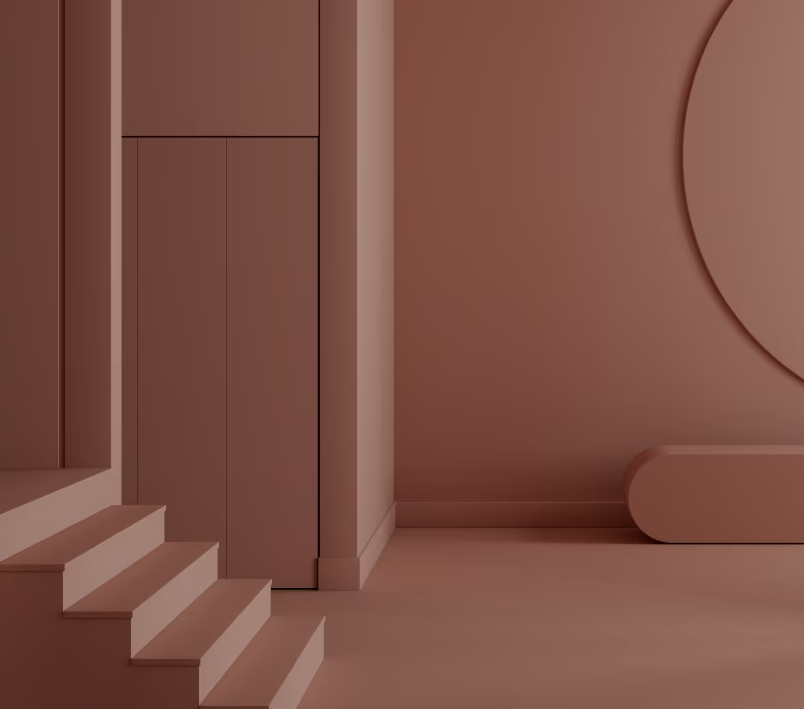
Several earthy and natural shades are particularly popular for 2024. These include:
- Clay Red: A rich, earthy red that brings warmth and vibrancy without being overpowering.
- Olive Green: A muted, sophisticated green that evokes the calming presence of nature. It’s versatile and works well in various settings.
- Sandy Beige: A soft, neutral color reminiscent of beach sands. This shade adds a light, airy feel to interiors and pairs well with other natural tones.
- Warm Taupe: A blend of gray and brown that adds depth and warmth to a space. It’s a versatile color that complements a wide range of décor styles.
- Terracotta: This warm, clay-like hue brings a rustic and comforting feel to any room. It can range from deep, rich tones to lighter, softer variations.
Suggestions for Using These Colors to Create a Calming and Inviting Atmosphere
To effectively incorporate earthy and natural tones into your home, consider the following suggestions:
- Full Wall Applications: Paint entire rooms or large walls with earthy tones to create a cohesive and enveloping feel. These colors can make a space feel grounded and cozy.
- Layering Tones: Combine different earthy shades within a room to add depth and interest. For example, pair terracotta walls with olive green furniture and sandy beige accessories.
- Natural Materials: Enhance the earthy palette by incorporating natural materials such as wood, stone, and woven textiles. These elements will complement the colors and enhance the natural ambiance.
- Accent Elements: Use earthy tones in accent elements like throw pillows, rugs, and curtains. This approach allows you to introduce these calming colors without committing to a full room transformation.
- Complementary Colors: Pair earthy tones with complementary colors to create a balanced look. For example, combine terracotta with cool blues or greens to add contrast and interest.
- Plants and Greenery: Integrate indoor plants and greenery to enhance the natural feel. Plants not only add to the aesthetic but also improve air quality and create a more inviting atmosphere.
- Soft Lighting: Use soft, warm lighting to highlight the richness of earthy tones. Avoid harsh, bright lights that can detract from the calming effect of these colors.
By thoughtfully incorporating earthy and natural tones, homeowners can create spaces that are both calming and inviting, reflecting a timeless and serene aesthetic that resonates with the natural world.
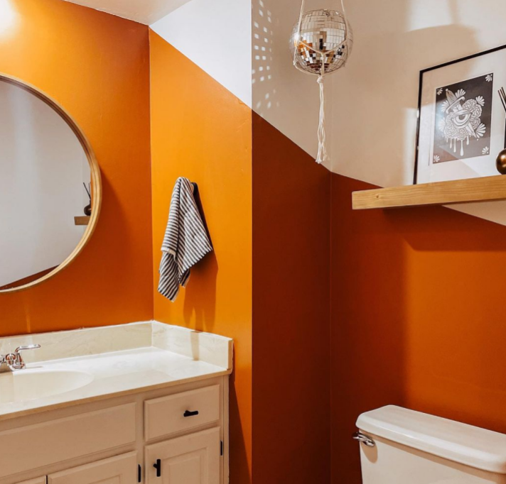
The Two-Tone Wall Trend

The two-tone wall trend involves painting a wall in two distinct colors, creating a visually striking and dynamic look. This design approach adds depth and interest to a room, making it appear more spacious and stylish. By combining two colors, homeowners can play with contrasts, highlight architectural features, and introduce a unique aesthetic element to their interiors.
Examples of Popular Color Combinations for Two-Tone Walls
Several color combinations are trending for two-tone walls in 2024. Here are some popular pairings:
- Navy Blue and White: This classic combination offers a crisp, clean look with a touch of elegance.
- Blush Pink and Charcoal Gray: This mix brings a modern and sophisticated vibe, balancing softness with strength.
- Sage Green and Cream: This pairing creates a soothing, nature-inspired ambiance.
- Mustard Yellow and Slate Blue: This bold combination adds warmth and a contemporary edge.
- Soft Gray and Pale Lavender: This subtle pairing introduces a gentle, calming effect to any room.
How to Choose the Right Split Point and Colors for Different Rooms
Selecting the appropriate split point and colors for two-tone walls involves considering the room’s purpose, size, and existing décor. Here are some tips to guide you:
- Determine the Split Point:
- Horizontal Split: A common approach is to paint the bottom half of the wall in a darker shade and the top half in a lighter color. This can make ceilings appear higher and rooms feel more spacious. Typically, the split point is at or just above chair rail height, around 3 to 4 feet from the floor.
- Vertical Split: For a bolder look, split the wall vertically, using two colors side by side. This works well in modern and contemporary spaces.
- Diagonal or Geometric Split: For a unique and artistic effect, consider a diagonal or geometric split. This can create a focal point and add a creative touch to the room.
- Choosing Colors Based on Room Function:
- Living Room: Opt for welcoming and warm combinations, such as earthy tones with neutrals, to create a comfortable and inviting space.
- Bedroom: Choose calming and restful colors, like soft blues paired with grays or pastels, to promote relaxation.
- Kitchen: Bright and vibrant combinations, such as yellows with whites or greens, can add energy and freshness.
- Home Office: Use sophisticated and focused pairings, like navy with white or charcoal with blush pink, to create a productive environment.
- Consider Room Size and Light:
- Small Rooms: In smaller spaces, use lighter colors on the top half to make the room feel larger and more open. Pair with a slightly darker shade on the bottom for balance.
- Large Rooms: Feel free to experiment with bolder and darker color combinations, as they can create a cozy and intimate atmosphere.
- Natural Light: Rooms with ample natural light can handle deeper and more vibrant colors, while darker rooms benefit from lighter, reflective shades.
- Coordinate with Existing Décor:
- Ensure the chosen colors complement the existing furniture, flooring, and accessories in the room. Use color swatches to test how the combinations look with the current décor.
By carefully selecting the right split point and color combinations, homeowners can successfully incorporate the two-tone wall trend, adding depth, character, and a touch of modern elegance to their interiors.
Textured Finishes
Textured finishes are becoming increasingly popular in interior design, as they add depth, dimension, and visual interest to walls. Unlike flat paint, textured finishes can create a tactile and dynamic surface that elevates the aesthetic appeal of a room. This trend aligns with the desire for more personalized and unique home environments, as textures can introduce a sense of craftsmanship and detail that plain walls lack.
Different Types of Textures
There are various types of textured finishes that homeowners can choose from, each offering a distinct look and feel:
- Faux Finishes: These finishes mimic the appearance of other materials, such as marble, wood, or concrete. Techniques like sponging, rag rolling, and color washing fall under this category, providing versatile and creative options for adding texture.
- Plaster: Plaster finishes, including Venetian plaster and stucco, offer a sophisticated and timeless look. These finishes can be smooth or rough, matte or glossy, and can add an old-world charm or a contemporary edge, depending on the application.
- Shiplap: This type of texture involves horizontal wooden boards that create a rustic and coastal feel. Shiplap can be painted in various colors or left in its natural wood state for a more organic look.
- Knockdown: A popular drywall texture that involves splattering and then flattening the surface to create a stucco-like appearance. It adds subtle texture and hides imperfections well.
- Brushed Pearl: A finish that provides a soft, iridescent shimmer, adding a touch of luxury and elegance to the walls.
Advice on Where and How to Use Textured Finishes in the Home
Textured finishes can be used strategically throughout the home to enhance its visual appeal and create focal points. Here are some tips on where and how to incorporate these finishes:
- Feature Walls:
- Use textured finishes on a single feature wall to create a striking focal point in a room. This could be behind a bed in the bedroom, the wall with the fireplace in the living room, or an accent wall in the dining area.
- Entryways and Hallways:
- Textured finishes can add interest to entryways and hallways, making these often overlooked spaces feel more inviting and stylish. Faux finishes or plaster can create a welcoming atmosphere as guests enter the home.
- Ceilings:
- Don’t overlook the fifth wall! Applying textured finishes to ceilings can add depth and character to a room. Consider plaster or knockdown textures to enhance architectural details.
- Kitchens and Bathrooms:
- Textured finishes can add durability and style to kitchens and bathrooms. Plaster or faux finishes can be used as a backsplash or on walls to create a unique and elegant look.
- Living Spaces:
- In living rooms and family rooms, textured finishes can create a cozy and warm atmosphere. Shiplap, for example, works well in creating a rustic or coastal vibe, while brushed pearl can add a touch of sophistication.
- Balance with Smooth Surfaces:
- To avoid overwhelming a space, balance textured finishes with smooth surfaces. For instance, if one wall has a textured finish, keep the other walls simple with flat paint.
- Experiment with Small Areas:
- If you’re new to textured finishes, start by experimenting in smaller areas like a powder room or a small alcove. This allows you to gauge the impact and refine your technique before applying it to larger spaces.
- Professional Application:
- For intricate textures like Venetian plaster or detailed faux finishes, consider hiring a professional to ensure a high-quality and polished look. Their expertise can make a significant difference in the final result.
By thoughtfully incorporating textured finishes, homeowners can add depth, character, and a touch of artistry to their interiors, creating spaces that are both visually stunning and uniquely personalized.
Sustainable and Eco-Friendly Paints
In recent years, there has been a growing demand for sustainable and eco-friendly paints as homeowners become more environmentally conscious and health-aware. This trend is driven by an increased understanding of the environmental impact of traditional paints, which often contain volatile organic compounds (VOCs) and other harmful chemicals. Sustainable and eco-friendly paints offer a greener alternative, aligning with broader movements towards sustainability and healthier living environments.
Benefits of Using Low-VOC or VOC-Free Paints
Using low-VOC or VOC-free paints provides numerous benefits for both the environment and the occupants of a home:
- Improved Indoor Air Quality:
- Traditional paints release VOCs into the air, which can contribute to poor indoor air quality and health issues such as headaches, dizziness, and respiratory problems. Low-VOC and VOC-free paints significantly reduce these emissions, leading to a healthier living space.
- Environmental Protection:
- Eco-friendly paints are formulated with natural, renewable, and non-toxic ingredients, reducing the environmental footprint of paint production and application. These paints minimize the release of harmful chemicals into the atmosphere, contributing to better overall air quality.
- Odor Reduction:
- Low-VOC and VOC-free paints emit fewer odors compared to conventional paints, making the painting process more pleasant and reducing the need for extended ventilation periods.
- Durability and Performance:
- Advances in eco-friendly paint technology have resulted in products that are just as durable and effective as traditional paints. These paints offer excellent coverage, color retention, and resistance to wear and tear.
- Safe for Sensitive Individuals:
- Eco-friendly paints are particularly beneficial for individuals with allergies, asthma, or chemical sensitivities. They create a safer environment for everyone, especially in homes with children and pets.
Recommendations for Popular Eco-Friendly Paint Brands
Several paint brands are leading the way in providing sustainable and eco-friendly options. Here are some popular choices:
- Benjamin Moore Natura:
- Benjamin Moore’s Natura line is certified asthma and allergy-friendly, with zero VOCs and zero emissions. It offers excellent performance and is available in a wide range of colors.
- Sherwin-Williams Harmony:
- The Harmony line by Sherwin-Williams is known for its low odor and zero VOC formulation. It also contains antimicrobial properties to resist mold and mildew growth, making it ideal for kitchens and bathrooms.
- Behr Premium Plus:
- Behr’s Premium Plus line is GREENGUARD Gold certified, ensuring it meets strict standards for low chemical emissions. It offers superior coverage and durability, along with a variety of finishes and colors.
- Farrow & Ball:
- Farrow & Ball offers eco-friendly paints made with high-quality ingredients and minimal VOCs. Their paints are known for their rich pigmentation and distinctive colors, adding a luxurious touch to any room.
- ECOS Paints:
- ECOS Paints provides non-toxic, zero VOC paints that are free from harmful chemicals. They offer an extensive color palette and are ideal for those with severe chemical sensitivities.
- Clare Paint:
- Clare Paint focuses on sustainability and simplicity, offering zero VOC paints in designer-curated colors. Their paint is self-priming, low odor, and has a smooth, durable finish.
- Earthborn Paints:
- Earthborn Paints is an environmentally friendly brand that produces breathable, non-toxic paints with minimal environmental impact. Their Claypaint is particularly popular for its matte finish and eco-credentials.
By choosing sustainable and eco-friendly paints, homeowners can contribute to a healthier environment and create safer, more pleasant living spaces. As awareness of these benefits continues to grow, the demand for eco-friendly painting solutions is set to rise, making it easier than ever to find high-quality, environmentally responsible options.
Accent Walls and Artistic Murals
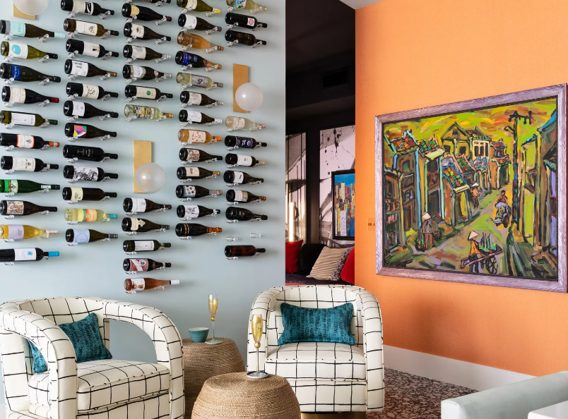
Accent walls have become a popular trend in interior design, offering a simple yet effective way to add depth, interest, and personality to a room. By painting one wall in a different color or applying a unique design, homeowners can create a focal point that draws the eye and enhances the overall aesthetic of the space. Accent walls provide an opportunity to experiment with bold colors and creative patterns without overwhelming the entire room.
Examples of Creative Accent Walls, Including Geometric Designs and Artistic Murals
There are numerous ways to create stunning accent walls, ranging from simple color contrasts to intricate designs. Here are some examples of creative accent walls:
- Geometric Designs:
- Triangles, Hexagons, and Other Shapes: Using painter’s tape and a few different paint colors, you can create striking geometric patterns that add a modern touch to any room.
- Color Blocking: Divide the wall into large sections, each painted in a different color. This technique can create a bold and contemporary look.
- Abstract Shapes: Mix and match different shapes and colors for a more artistic and unique design.
- Artistic Murals:
- Nature-Inspired Murals: Bring the outdoors inside with murals depicting forests, mountains, or ocean scenes. These designs can create a serene and relaxing atmosphere.
- Urban and Industrial Themes: Murals featuring cityscapes, skylines, or industrial elements add a trendy, metropolitan vibe.
- Floral and Botanical Designs: Large, colorful flowers or leafy patterns can brighten up a room and add a touch of nature.
- Custom Art: Commission a local artist to create a custom mural that reflects your personal style and interests.
- Textured and Patterned Walls:
- Wood Paneling or Shiplap: Add a rustic or coastal feel with wooden planks or shiplap painted in a complementary color.
- Wallpaper: Use bold or patterned wallpaper on one wall to make a statement. Wallpaper has made a comeback and offers a wide range of designs.
- Stencil Designs: Stenciling allows for precise, repeatable patterns and can be an affordable way to create a detailed design.
Tips for Selecting the Right Wall and Design for an Accent Wall
Choosing the right wall and design for your accent wall is crucial for achieving the desired effect. Here are some tips to guide you:
- Select the Right Wall:
- Focal Points: Choose a wall that naturally draws attention, such as the wall behind a bed, sofa, or dining table. This will enhance the existing focal point and create a balanced look.
- Avoid Cluttered Walls: Opt for a wall that isn’t obstructed by large furniture pieces, windows, or doors. A clear wall ensures that the design can be fully appreciated.
- Architectural Features: Highlight architectural features like fireplaces, built-in shelves, or arches by making them part of the accent wall.
- Consider the Room’s Purpose:
- Living Room: Use warm, inviting colors or designs that reflect your personal style. Geometric patterns or murals can add character to the space.
- Bedroom: Choose soothing colors and designs that promote relaxation. Nature-inspired murals or soft, textured walls can create a calming environment.
- Dining Room: Bold, dramatic colors or elegant patterns can add a touch of sophistication. Consider a mural or wallpaper that complements your dining set.
- Harmonize with Existing Decor:
- Ensure that the colors and patterns chosen for the accent wall complement the room’s existing color scheme and decor. Use color swatches and samples to test how the design will look with your furniture and accessories.
- Scale and Proportion:
- Consider the size of the wall and the scale of the design. Large patterns or murals work well on expansive walls, while smaller, more intricate designs may be better suited for smaller spaces.
- Lighting:
- Take into account the room’s natural and artificial lighting. Bright colors and bold designs may look different under various lighting conditions, so test your choices at different times of day.
- Personal Preference:
- Ultimately, choose a design that resonates with your personal taste and makes you feel comfortable and happy in your space. Don’t be afraid to express your individuality through your accent wall.
By thoughtfully selecting the right wall and design, you can create an accent wall that adds depth, interest, and a unique flair to your home. Whether through bold colors, geometric patterns, or artistic murals, accent walls are a versatile and impactful way to enhance your interior spaces.
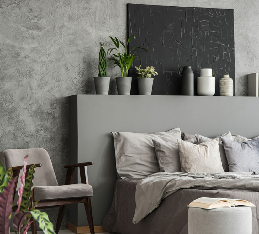
Dark and Moody Color Palettes
Dark and moody color palettes are gaining popularity in interior design for their ability to create a sophisticated, dramatic, and cozy atmosphere. These palettes often evoke a sense of luxury and depth, making spaces feel more intimate and refined. The trend towards darker hues reflects a shift from the minimalist, light-colored interiors of the past decade to more bold and expressive designs. Dark colors can add a sense of mystery and elegance, transforming a room into a stunning retreat.
Popular Dark Shades such as Navy Blue, Charcoal, and Deep Green
Several dark shades are leading the way in this trend, each bringing its unique character and mood to a space:
- Navy Blue: A classic and timeless choice, navy blue exudes sophistication and tranquility. It pairs well with metallic accents like gold or brass, adding a touch of glamour.
- Charcoal: This deep, neutral gray offers a sleek and modern look. Charcoal can ground a room and serve as a versatile backdrop for various decor styles and colors.
- Deep Green: Shades like forest green or emerald add a rich, organic feel to interiors. Deep green brings the calming effect of nature indoors and can be both bold and soothing.
How to Balance Dark Colors with Lighter Elements to Avoid a Gloomy Atmosphere
While dark colors can create a beautiful and dramatic effect, it’s important to balance them with lighter elements to prevent the space from feeling too heavy or gloomy. Here are some tips for achieving a harmonious look:
- Incorporate Light-Colored Furniture and Accessories:
- Use light-colored furniture, such as white or beige sofas and chairs, to contrast with dark walls. Light rugs, cushions, and throws can also break up the darkness and add visual interest.
- Add Metallic and Reflective Surfaces:
- Incorporate metallic accents like gold, silver, or brass through light fixtures, mirrors, and decor items. Reflective surfaces help bounce light around the room, making it feel brighter and more open.
- Use Adequate Lighting:
- Ensure the room has ample lighting from various sources, including overhead lights, floor lamps, table lamps, and wall sconces. Layered lighting helps illuminate dark walls and prevents the space from feeling closed in.
- Choose Light-Colored Textiles:
- Opt for curtains, bedding, and upholstery in lighter colors to balance the dark palette. Light fabrics can add softness and contrast, creating a more inviting atmosphere.
- Incorporate Natural Elements:
- Introduce natural elements like wooden furniture, plants, and woven baskets. The organic textures and colors of wood and greenery can add warmth and balance to dark interiors.
- Highlight Architectural Features:
- Use dark colors to highlight architectural features such as moldings, built-in shelves, or fireplaces. Painting these elements in a dark shade can add depth and interest without overwhelming the entire space.
- Balance with Neutral Tones:
- Pair dark walls with neutral tones like white, cream, or light gray. Neutrals can soften the impact of dark colors and create a more balanced and harmonious look.
- Create Contrast with Artwork:
- Hang light-colored or brightly colored artwork against dark walls. This contrast draws the eye and adds a focal point, preventing the room from feeling monotonous.
- Consider a Feature Wall:
- If you’re hesitant to paint an entire room in a dark color, start with a feature wall. This allows you to experiment with the trend without committing to a full dark palette.
- Use Dark Colors in Smaller Doses:
- Apply dark colors in smaller doses, such as on cabinetry, trim, or doors, rather than on all four walls. This approach can add depth and interest without overwhelming the space.
By thoughtfully incorporating dark and moody palettes with lighter elements, homeowners can create a balanced, inviting, and sophisticated interior that embraces this bold trend.
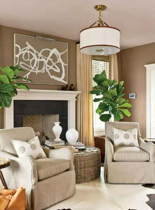
Classic Neutrals with a Twist
Classic neutrals like white, beige, and gray have long been staples in interior design for their timeless appeal and versatility. In recent years, these traditional neutrals have been infused with modern elements to create fresh, contemporary looks. The trend involves subtle updates and creative reinterpretations that breathe new life into familiar color schemes while maintaining their inherent elegance and adaptability.
Examples of Subtle, Yet Impactful, Updates to Traditional Neutral Palettes
- Warm Neutrals with Depth:
- Creams and Off-Whites: Instead of pure white, opt for warmer shades like creamy whites or off-whites with a hint of yellow or pink undertones. These colors add warmth and softness to a room, creating a cozy and inviting atmosphere.
- Beige with Undertones: Choose beige tones that incorporate subtle undertones such as gray, taupe, or even lavender. These nuances add depth and sophistication to beige walls or furnishings, making them more dynamic than traditional beige.
- Greige (Gray + Beige):
- Greige has become a popular choice for its ability to bridge the gap between gray and beige. This versatile neutral works well in both modern and traditional settings, offering a contemporary twist on classic neutrals.
- Examples: Sherwin-Williams’ “Agreeable Gray” or Benjamin Moore’s “Revere Pewter” are popular greige shades that blend warmth with neutrality.
- Soft and Subdued Grays:
- Instead of stark, cool grays, opt for softer shades with warm undertones. These grays can range from light to mid-tone and create a serene backdrop that pairs well with various accent colors and textures.
- Examples: Benjamin Moore’s “Edgecomb Gray” or Farrow & Ball’s “Skimming Stone” are examples of soft grays that add sophistication without feeling cold.
- Bold Accents in Monochrome Settings:
- Use classic neutrals as a backdrop for bold accent colors. For instance, a predominantly white or beige room can feature vibrant artwork, furniture, or decor pieces in shades of teal, navy blue, mustard yellow, or emerald green. This contrast creates a striking focal point and adds personality to the space.
Ideas for Incorporating These Neutrals to Create a Timeless Look
- Layering Neutrals:
- Create depth and interest by layering different shades of neutrals in a room. For example, pair light gray walls with darker gray furniture upholstery and cream-colored curtains. This layering technique adds dimension while maintaining a cohesive look.
- Texture and Contrast:
- Introduce texture through fabrics, rugs, and wall finishes to enhance the visual appeal of neutrals. Consider using materials like linen, wool, leather, or matte finishes alongside smooth surfaces to create contrast and tactile interest.
- Natural Elements:
- Incorporate natural materials such as wood, stone, and plants to complement neutral palettes. Wooden furniture or flooring adds warmth, while greenery brings freshness and vitality to the space. These elements connect the interior with nature, creating a harmonious and timeless environment.
- Mixing Traditional and Modern Elements:
- Blend traditional furniture styles with modern decor accents to achieve a balanced and eclectic look. For example, pair a classic beige sofa with contemporary artwork and metallic accessories for a curated and stylish living space.
- Embrace Minimalism:
- Emphasize clean lines, simplicity, and functionality to highlight the beauty of classic neutrals. Avoid clutter and unnecessary ornamentation, allowing the neutral palette to speak for itself and create a serene, uncluttered atmosphere.
By infusing classic neutrals with modern twists and thoughtful design elements, homeowners can create interiors that are both timeless and on-trend. Whether through subtle updates or bold contrasts, these neutral palettes offer endless possibilities for creating sophisticated and inviting living spaces.
Reviving Retro Colors

Retro colors from the 1960s, 1970s, and 1980s are experiencing a resurgence in interior design, inspired by nostalgia for past decades and a desire to infuse spaces with vibrant, bold hues. These colors evoke a sense of nostalgia and playfulness, offering a departure from the subdued tones of recent years. From avocado green to mustard yellow, retro colors bring a sense of personality and charm to contemporary interiors, revitalizing them with a retro twist.
Popular Retro Shades Making a Comeback
Several retro shades have re-emerged as favorites among homeowners and interior designers:
- Mustard Yellow: This warm, earthy yellow adds a sunny, cheerful vibe to any room. It pairs well with neutral tones and works as both a main color and an accent.
- Avocado Green: A staple of the 1970s, avocado green has made a comeback in modern interiors. Its muted, earthy tone adds depth and a sense of calm, particularly in kitchens and living areas.
- Burnt Orange: Reminiscent of the 1960s and 70s, burnt orange injects warmth and energy into spaces. It works well as an accent wall color or in furnishings like sofas and chairs.
- Terracotta: This earthy, reddish-brown hue adds a rustic, Mediterranean feel to interiors. Terracotta tiles, walls, or accents bring warmth and character to any room.
- Powder Blue: A soft, pastel blue popular in the 1950s and 60s, powder blue adds a serene and nostalgic touch to bedrooms and living areas.
- Mauve: A muted shade of purple-gray, mauve adds a soft, sophisticated feel to interiors. It pairs well with both warm and cool tones, making it versatile for various design schemes.
Suggestions for Integrating Retro Colors into Contemporary Interiors
Integrating retro colors into contemporary interiors can be done thoughtfully to achieve a balanced and stylish look:
- Start Small with Accents:
- Incorporate retro colors through accents such as throw pillows, rugs, artwork, or small decor items. This approach allows you to experiment with different hues without committing to a large-scale change.
- Feature Walls or Focal Points:
- Use retro colors on a feature wall to create a bold statement. For example, a mustard yellow accent wall in a living room can anchor the space and complement neutral furniture and decor.
- Combine with Neutrals:
- Pair retro colors with neutral tones such as white, gray, or beige to balance their boldness. This contrast allows the retro shades to stand out while creating a cohesive and harmonious overall look.
- Mix Patterns and Textures:
- Combine retro colors with patterns and textures for added visual interest. For example, mix a burnt orange sofa with geometric-print pillows or a terracotta rug with wood furniture to create a dynamic and inviting space.
- Modernize with Contemporary Elements:
- Update retro colors with contemporary furnishings and decor pieces. Incorporate sleek, modern furniture styles or minimalist designs to create a fresh and current interpretation of retro aesthetics.
- Consider Retro-Inspired Accessories:
- Choose accessories and lighting fixtures that reflect retro design elements. For instance, mid-century modern lamps or vintage-inspired artwork can enhance the retro vibe without overwhelming the space.
- Use Retro Colors in Unexpected Places:
- Think beyond walls and furniture. Consider using retro colors in unexpected places such as kitchen cabinets, bathroom tiles, or door frames to add personality and character to functional areas.
By embracing retro colors and integrating them thoughtfully into contemporary interiors, homeowners can create spaces that are nostalgic yet stylishly modern. Whether through small accents or bold design choices, retro colors offer endless possibilities for infusing personality and charm into every room of the home.
In 2024, interior painting trends are all about embracing creativity, personality, and a touch of nostalgia. From bold and vibrant colors to classic neutrals with a modern twist, homeowners have a plethora of options to refresh and redefine their living spaces. Here’s a recap of the top trends shaping interior painting this year:
- Bold and Vibrant Colors: Infuse energy and character into rooms with shades like emerald green, navy blue, and rich ochre.
- Earthy and Natural Tones: Create serene and inviting atmospheres with terracotta, olive green, and sandy beige hues.
- Two-Tone Walls: Add depth and sophistication with contrasting color combinations tailored to each room’s unique ambiance.
- Textured Finishes: Elevate interiors with textured walls like faux finishes, plaster, or shiplap for added depth and visual interest.
- Sustainable and Eco-Friendly Paints: Opt for environmentally conscious choices with low-VOC or VOC-free paints that prioritize health and sustainability.
- Accent Walls and Artistic Murals: Make a statement with creative accent walls or artistic murals that showcase individual style and creativity.
- Dark and Moody Palettes: Embrace sophistication and drama with shades like charcoal, deep green, and navy blue, balanced with lighter elements for a harmonious atmosphere.
- Classic Neutrals with a Twist: Update traditional neutrals with warm undertones, greige blends, and minimalist approaches for a timeless yet modern look.
- Reviving Retro Colors: Bring back the charm of decades past with shades like mustard yellow, avocado green, and powder blue, infusing spaces with nostalgia and vibrancy.
As you consider these trends, remember that painting is more than just color—it’s an expression of your personal style and a transformation of your living environment. Dare to experiment, mix and match, and discover what resonates best with your home’s unique architecture and your family’s lifestyle. Refresh, renew, and redefine your home with the power of paint. Embrace the trends of 2024 and create a living environment that reflects your personality and enhances your everyday life.